Why Responsive Web Design is the Most Important Feature for Your Website
Why Responsive Web Design is the Most Important Feature for Your Website

Different websites require different features and functions to be successful, depending on the vision and purpose of the website. For example, a user-friendly checkout system and some kind of inventory control would be important features for an e-commerce website. However, regardless of the specific needs of different websites, there is one feature that becoming necessary for websites to be successful, which is mobile-friendliness and responsive web design.
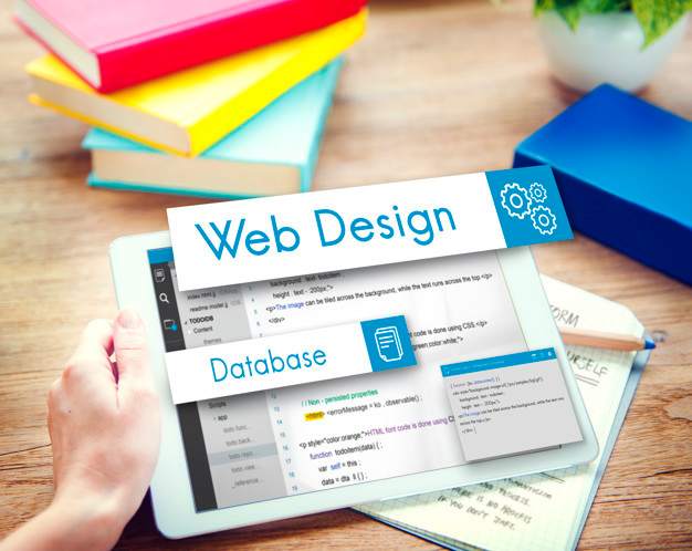
What is responsive web design?
Responsive web design enables a website’s layout to change as the size of the screen used to view that website changes. One example of a responsive web design can be a widescreen display can show a website design with multiple columns of content, whereas when the same is viewed on a smaller screen, the same content appears in a single column with text and images appropriately sized to be effective on the smaller display screen.
There many reasons why responsive web design has become one of the most important features that you can add to your website.
Better website loading time:
Websites that made mobile responsive tend to load faster on all devices, particularly smartphones and tablets. Due to responsive images and fluid grids, web pages take significantly less time to load, which directly impacts the duration of users’ visit. According to a recent study, around 53% of mobile visitors will abandon a website if it takes longer than 3 seconds to load.
Lower bounce rates:
The bounce rate of your website tells you the percentage of visitors who navigated away from your website after only seeing a single page. As mentioned above, a responsive web design increases the chance of visitors staying longer on your website, which will reduce your bounce rate. Your visitors will be more likely to click through the website and read the content you have worked so hard for and explore everything you have to offer.
Higher conversion rates:
More time spent on your website and the lower bounce rate are the first steps to improve your visitors’ user experience and build trust in the brand. The improved user experience and trust often lead to better conversion rates. This may mean more signups to your newsletter, more purchases or more calls for booking.
Better SEO:
A responsive web design further helps you improve your search engine rank. Google considers how mobile friendly your website is and accordingly determine the rank of your website in the search engine results pages. Moreover, a responsive website also helps you with building back links. Back links are one of the important aspects of an effective SEO strategy, as shows your website to be a reputable source of information on the search engines.
More social sharing:
When done correctly, responsive web design can really help increase social shares of your content. This is also one of the many benefits of the mobile-friendly website. Responsive content on your website, when paired with responsive social media sharing option, will make it too easy for your visitors to share the content that they may like. It helps increase your credibility, it gives you more exposure to new audiences and may lead to more traffic and conversions.